I really don’t feel like it’s being used like that here though.
56!
they/them
- 0 Posts
- 34 Comments
 3·4 days ago
Well I only play a single game, at 30fps and 50% resolution, because I really dislike the fan coming on.
Outside games, I guess higher resolution is better for reading text, but 2k should be enough for that.
Maybe it’s a soy sauce situation. Bears are named after bears cave.

 6·6 days ago
Every toilet’s a bathtub if you believe in it enough.

 7·11 days ago
I’ve never tried having the app on multiple devices - I specifically didn’t want it on my phone - but it’s worth a try. I use whatsapp web in firefox, and only start waydroid when I need to log in again. The third party linux apps just load whatsapp web in electron or something.

 15·11 days ago
Exactly. I created my whatsapp account in waydroid like this.
They have already bought .org and .net. I guess they just haven’t set them up yet.

 2·2 months ago
trefle.io has data from various sources, though a lot of pages are rather empty.

 1·3 months ago
Nexus 5X still going strong!
(though it did need some hacking to keep it alive)

 0·3 months ago
Sadly KDE is also trying out the “modern” style tabs in some places too:


 0·3 months ago
Right, that makes sense as well. What I was thinking is that the use of the accent colour shows which one is active, though it would probably be less confusing if this wasn’t done with an outline. See the KDE version for example:

Regarding keyboard navigation, I could see this working similarly to radio buttons, where the tab key selects the entire tab group, and tabs need to be navigated using the arrow keys. In this case I think it makes sense to put the focus border around only the selected option, and having the focus border follow the selected option when arrow keys are used. If this is the case, I think swapping the current version does make sense.

 0·3 months ago
If they did the exact opposite of this, I think it would look ok. If I was trying to fix this, I would probably just swap the styles of the selected and deselected states. Maybe it’s a miscommunication between designers and implementers, causing the meanings to be swapped?

 2·3 months ago
Well… I’ve tried to find out just now. Most taller lighthouses are on small rocks in the sea. On some the lighthouse covers the entire rock. I have also discovered that there are potentially taller land-based lighthouses in the uk, this one just seems to be best at advertising it.

 18·3 months ago
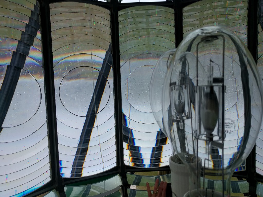
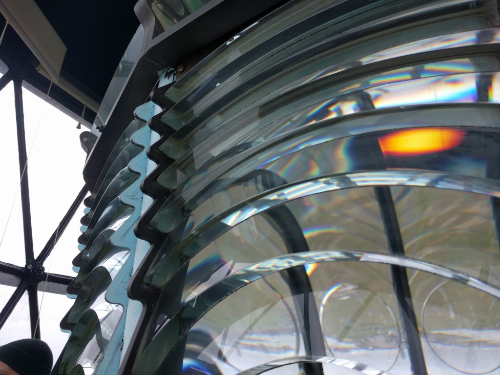
Inside the fresnel lens of a lighthouse. (The tallest land-based lighthouse in the UK)
I use LeechBlock NG. It has many different blocking options, including greyscale, or a countdown before the page loads.
You can use command line arguments for minetest to bypass the built in menu. You could then re-implement all menu features yourself.
It’s gradually getting there. The settings redesign was introduced a few versions ago, and the online content menu redesign will hopefully land in the next version (and potentially replace the current content tab after that). I agree that the main menu redesign might be a while away though.
I believe it is the implementation of the tick system in Mesecons (which VoxeLibre redstone is based on) that is the issue, and I agree it makes it nearly useless. It is absolutely an issue with the mod, not the engine, but would probably require a big rewrite of the mod to fix (not that I’m familiar with the actual implementation of mesecons).


p2p from behind a CGNAT works just fine as long as a single server is accessible and can mediate connections between other peers. Most non-servers are behind some sort of NAT these days.