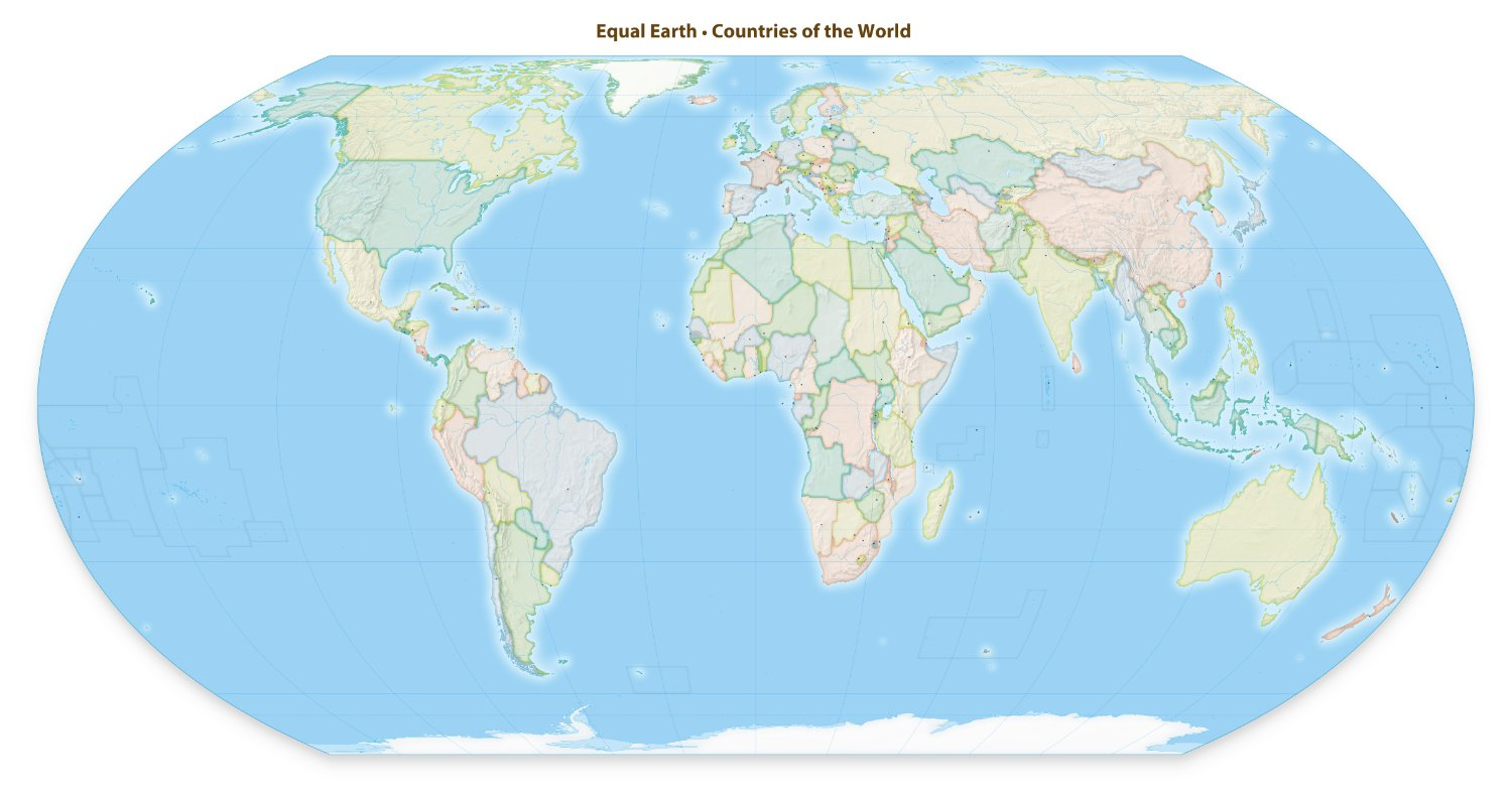
Why does the map on the website need that draggable divider when both versions show both types of projection?
The globe in the thumbnail is really bothering me. Does the artist not know how to align objects?
It was probably done for free by some volunteer dude… You can contact them and offer to fix it for free probably
It’s a bit hard to find out where it actually originated from and who’s behind it. Judjing by their social media handlers, it’s a marketing agency Hello Makeda. Maybe it’s just me, but I don’t trust marketing agencies to be good judges on geographical projects.
Mercator distorts landmass to fit the grid, so it is good for navigation, simply draw a straight line between two points and follow it. Also, the plea on that site is just…weird. Africa is not taken seriously because it is displayed too small on maps - what? It is a large, chunky continent that can be compressed without too much detail loss - Europe, not so much.
Ampak Mercator je najboljši sosed. 😢
This is such a garbage take. There is no way to “show our world as it truly is” in two dimensions. I’m all about showing other projects and orientations. Classrooms should have “upside down” maps and Albert maps for example. But we should also teach that each projection has benefits and drawbacks. I was taught that decades ago. Have we stopped?
99% of people dont know that there other projections. I dare you to ask people which map projection is their favorite.
Ideally yes we should stick to standard and make sure everyone knows thay there are many variants and none of them perfectly represent the sphere were on but thats not happening.
I don’t believe that 99% figure for a second. Unless geography is removed from all curricula worldwide. Even still, that ignorance would not signify what this movement implies. It is a useful map; end of story. If the movement were, “We should increase public knowledge of geography and how projections work,” fine. But it isn’t.
Africans: You know, 14th century mercator maps are horribly disproportionate over 1/2 the map and are the maps of reference for most online apps, software and textbooks. There are better projections that balance location for actual land mass, we should probably use those.
lemmy: garbage take.
There aren’t better maps. Only maps with different tradeoffs. ALL 2d maps of spheres are disproportionate.
There absolutely are better maps for specific purposes. Or do you think this map would be no better or worse for the purpose of teaching school children?

Oh boy! Are you serious? Let me be more precise, in case. There aren’t actual projections that are better in all cases than the Mercator projection. There are maps that are better in given cases. ALL maps have trade offs. The one you shared, included. It certainly benefits from the humor of pointing out why this is an issue in the first place.
No, there aren’t perfect maps. There ARE better maps.
Mercator’s one trick is north is always straight up, so it’s great for navigation with a compass. If you’re navigating the oceans on a ship, or even using GPS in your car, Mercator is GOAT because you don’t have to twist it as your drive to keep north up. Unfortunately, we default to Mercator just about everywhere in places where it really has disadvantages.
If you’re just looking at the map to locate things, or compare countries there are dozens of better maps and our decision to default to mercator for most uses us
The way the world’s going, the next accepted projection will be depicted on the backs of four elephants atop a turtle.
Bring on the Wizzards
I do hope we get the luggage…
This is so dumb what do you mean replace you have a phone and can look up different versions as u please
They’re speaking of the standard and default in most map representations.
i think the best solution (besides globes which are impractical on screens/posters) is having no standard, expose kids in school to 3 or 4 different projections so they learn there’s no standard and all protections are as valid and all with drawbacks and advantages.
You’ve unlocked a weird memory. The Windows CD version of Where In The World Is Carmen Sandiego did exactly that. It had that map screen where you’d pick where to chase the bad guy, and they used different map projections. I can find screenshots of the game showcasing a Mercator, Robinson and Goode Homolosine projections. And it’s not different editions of the game, it would change between missions.
Yeah I had a Peters Projection map when I was young and there wasn’t any big deal over it, somehow I just assumed everyone did.
For me, Peter’s projection will always be in second place behind simply using a globe: keeps cardinal directions, easy to find precise coordinates with a ruler, correct continent significance while only using straight lines, simple, and easy to use.
Peeps always says i’m evil because everything is distorded on it but i don’t care about distortion, I just want something rectangular and accurate.
The Mercator projection was great for navigating oceans, baring remain correct. There are thousands of other map projections that do a better job preserving size, shape, directions, and distances. Any projection will be a tradeoff between these.
As far as I know the Mercator projection has mostly fallen out of use in education, and I don’t think there’s any standard that requires it anywhere. So I’m not sure exactly what this is about.
I don’t think there’s any standard that requires it anywhere. So I’m not sure exactly what this is about.
Don’t give the right any ideas. They’ll be on about “geometric purity” or other such nonsense. Or anything but Mercator will just be “woke.”
“The woke liberal left wants to changes maps to make America smaller! Cause they hate America! We will stand against this liberal assault on American sovereinty with the new Trump Map, which shows the true size of America compared to every other country! Order your new Trump Map today for 399.98!”
Nah they all use the Azimuthal Equidistant Projection
CMV: this movement only matters to stupid people, and does not qualify as something “I should know”.
I’ll split this into two:
only matters to stupid people
People who are interested in geography, geometry, cartography, political science, geopolitics, culture, cognitive biases, ethnocentrism… generally not a low IQ cohort.
and does not qualify as something “I should know”
Ironically this might be true, just not for reasons that are flattering to you…
People who are interested in geography, geometry, cartography, political science, geopolitics, culture, cognitive biases, ethnocentrism
I maintain that none of those people are the ones interested in this movement, and if you believe they are, you haven’t spent any time thinking about it. Again, I’m looking for any actual legitimate argument in support of it. A condescending argument from hypothetical authority isn’t going to cut it.
maybe a little abrasive in tone but i don’t totally disagree, this is kind of fucking dumb and i don’t understand why i’m seeing this everywhere rn.
mercator hasn’t been ubiquitous in decades and when it is used today there’s usually an actual reasoning, however valid one decides it to be.
what the fuck are these people talking about?
a campaign for this? what, are we going to campaign to cease the use of subway maps next because they give a dishonest sense of size and scale of metros?
this feels like weird distraction bait from things that actually matter.
mercator hasn’t been ubiquitous in decades
This is the correct take… The only time people care about maps these days are when they go to maps.google.com. And that’s an actual 3d representation. Therefore this issue is such a non-fucking-issue that I don’t understand why I’ve seen so much noise about it here.
It’s stupid.
Does it matter that I don’t know the actual size of Africa compared to Greenland? No… It’s completely irrelevant to just about anyone’s day to day life. And even if I did grow up on a map that was more accurate… You know what I’d likely miss out on then? Actual directionality which DOES matter more for a typical person.
Looking at the other maps presented in these threads… They all lose the ability to reference NSEW compass directions.
Except for one… and guess what… that one is the one that I actually remember from school. Or at least a variation close enough to it that can’t make out any difference from my memory.
Yeah, I’m open to any valid arguments for why it would matter, but I haven’t seen any. People who think land size should correspond to representation are…to be more diplomatic: not making any effort to think things through.
Fuck this. We can do
betterworseDYMAXION MAP OR GTFO

EDIT: details
It has less distortion of relative size of areas, most notably when compared to the Mercator projection; and less distortion of shapes of areas, notably when compared to the Gall–Peters projection. Other compromise projections attempt a similar trade-off.
More unusually, the Dymaxion map does not have any “right way up”. Fuller argued that in the universe there is no “up” and “down”, or “north” and “south”: only “in” and “out”.[9] Gravitational forces of the stars and planets created “in”, meaning “towards the gravitational center”, and “out”, meaning “away from the gravitational center”. He attributed the north-up-superior/south-down-inferior presentation of most other world maps to cultural bias.
Each region on a dymaxion map is absolutely fine though, it’s just when you put it all together it becomes god awful.
A butterfly map is a better compromise if you need a world map.
If you have a physical Dymaxion Map, you make each vertex a hinge so you can swing to connect the bits you want to be adjacent for the purpose at hand.
Now I need to watch a video on how globes are made
This will never happen as long as Big Greenland pulls the strings of power in the cartography world.
It’s time the U.S. deals with big Greenland once and for Oil.
And they’re very big. Have you looked at a map lately? Do you expect tiny little Africa to stand up to that?